
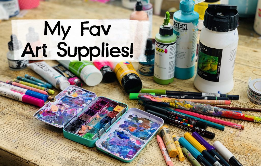

Hey there fabulous friends! :) Time for a more up to date blog post on my favourite art supplies! I’ve been pretty consistent over the years with which supplies I’ve favoured, but it has changed quite a bit in the last couple of years, so I thought I’d do a new bloggie on this for you! Yay! :) Here we go!
1. My favourite paper used to be (and I still like it a lot now!) = Daler Rowney – The Langton – Hot-pressed Watercolour Paper – 140lb. 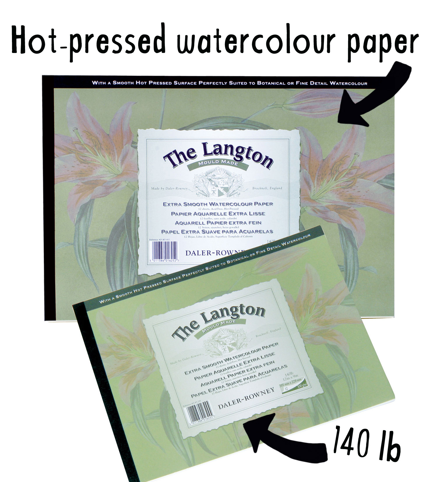
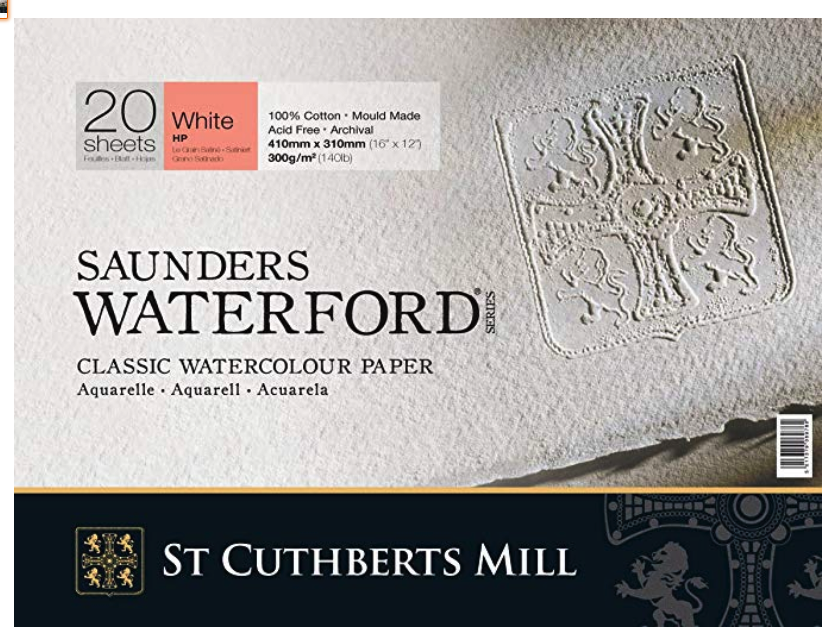
But is now: Saunders Waterford Paper Block – 12x16in (31x41cm) HP
I prefer hot-pressed over cold pressed, the difference is that hot-pressed is much smoother than cold pressed. There is more of a grain in cold pressed which I don’t really like. I found a little image on google showing the difference:
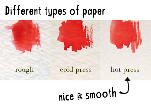
Also, if you do heavy mixed media layering with wet work, paints and collage you want to go for a minimum weight of 14olb (300gsm2). Thinner paper will not be able to withstand heavy mixed media work unless you gesso it thoroughly. :) Other good brands I use for paper too: Saunders & Waterford/ Fabriano (again I like: hot-pressed).
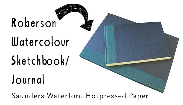
2. My favourite journal to work in. First up: I still haven’t found *the perfect* journal yet. It’s all about the paper for me, but one is coming very close to being perfect and it’s the Watercolour Sketchbook (HP) by Roberson (with Saunders & Waterford paper). Sadly, they’ve discontinued it! :(. A second fav is the Saunders Waterford (HP) journals, they’re a little easier to find online, just google! :)
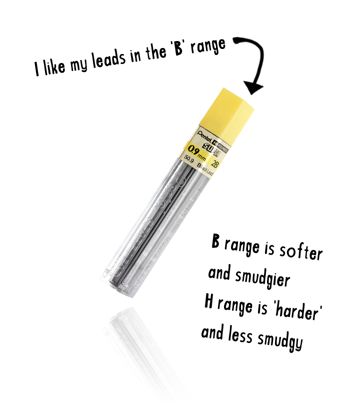
3. My favourite pencil is the Graphgear 1000 by Pentel. This is quite a pricey mechanical pencil but it’s worth it. What I like about this pencil is that it’s weighted, so it feels heavier in your hand than some of the cheaper ones (though they are cool too). I like my leads in the ‘b’ range and the size: 0.9. The size refers to how thin or thick the lead is. The smaller you go, the thinner your lead, the more detailed/ finer work you can do. 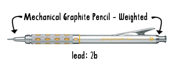
Regarding the weight of the lead: ‘b’s’ are softer and smudgier, ‘h’s’ are ‘harder’ and less smudgy, here is a swatch of lead scribbles (found through google image search) that shows you the difference:
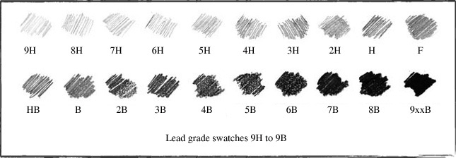
Btw: totally didn’t know there was an ‘F’ option!
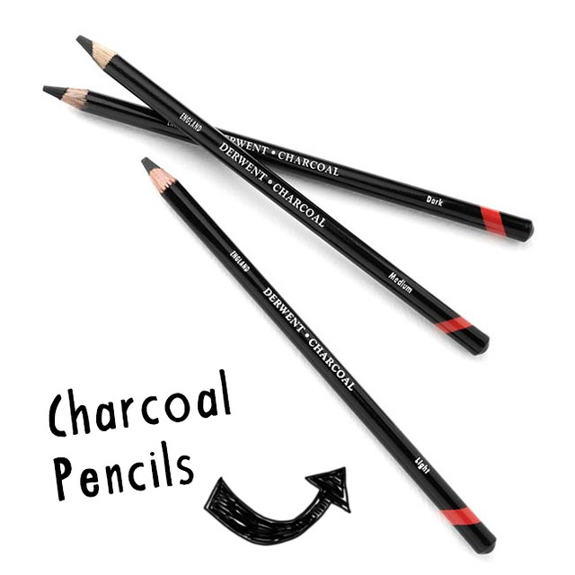
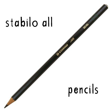
 4. Though graphite is still my favourite sketching tool, I’ve started using Charcoal Pencils (Derwent and other brands), Stabilo All pencils (or China markers) a lot more too nowadays. This specifically when I want to achieve a dark shading without the reflection of the graphite. Charcoal is great as it’s pitch black and you can smudge it, the Stabilo All pencil is great because it writes over anything and everything and is watersoluble (but isn’t super great for smudging). I recommend both! :)
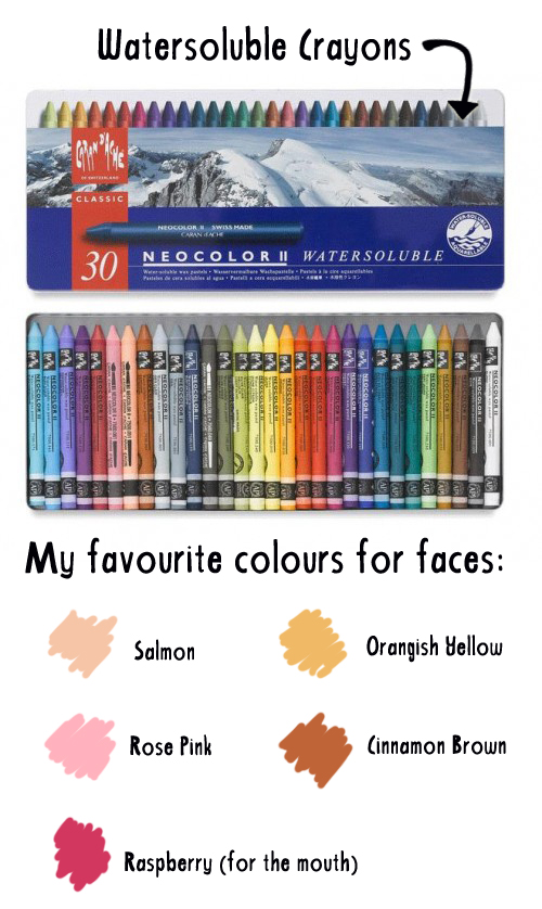
5. I use a variety of paints, from watercolour paints in tubes, gouache, acrylics to watercolor pencils but my go-to and favourite paint supplies are my beloved watersoluble crayons (Caran D’ache Neocolor II). I love them. They are basically really vibrant watercolour paints in a stick. They are really versatile and the colours just pop. You can use them as a crayon (dry) or you can scribble/ add colour to your page and then ‘activate’ the paint with some water and a paintbrush. You can also lift paint straight off the crayon with a wet brush. Super versatile these babies. Regarding brands, I haven’t actually used any other brands than Caran D’ache but from what I hear, other brands’ crayons don’t seem to compare. PS. careful when buying these, the box that holds the non-watersoluble wax crayons looks almost identical to the watersoluble crayons (Neocolor I’s).
I have recently come to love some other watersoluble paints! I absolutely adore Jane Davenport watercolour paints and her mermaid markers too! They are super vibrant (the way I like my paints) and can be written over with posca pens really well!
6. My favourite brushes are by Pro Arte – England. I like the “acrylix brushes“, they have a nice balance between being firm and soft. They are not too coarse, the hairs are fine and hold up quite well for all the mixed media stuff I do. Shape wise I usually choose the square shaped ones, but I have some round tipped and pointy tipped ones too. 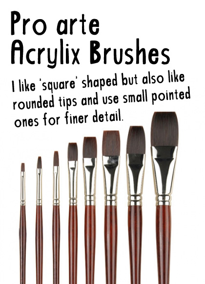
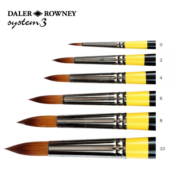
And now that I’m working with more watercolours, I’ve loved working with the Daler Rowney System 3 Watercolour Brushes!
7. White Gesso. So, I’ll admit, for a long time I didn’t really get gesso. I was all like: why would I need to prime any of my surfaces, they’re already prepared so I can paint on them, sooooo? Now, I love love love my white gesso. I use it for a variety of things: sometimes when a painting is just going nowhere and I feel like I need to start over, I gesso over a painting and tadaa; I can start again. I also use white gesso as part of my layering process; I love brayering gesso over a mixed media background if I need to ‘mute it down’ a little. I use gesso as a white paint. In the past I would use white acrylics, but I now use white gesso for highlights or anywhere I need to add white colour paint. Lastly, I do sometimes use white gesso as a primer, if I work on a surface that is thin-ish and I need it to be sturdier, I’ll add a layer of gesso (for instance, some of the moleskines have thin pages, gesso helps firming them up). Brand wise, I’ve only ever used winsor & newton galeria and very happy with that one. There are a lot of different gessos out there though, some are coarser, some less coarse, gesso also comes in black and transparent too. 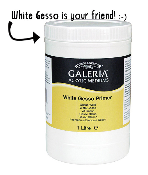
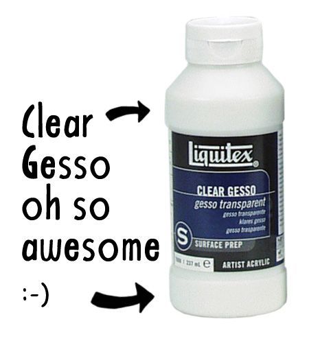
8. Speaking of gesso, another one of my favs is clear/ transparent gesso. Clear gesso is brilliant if you do a lot of collage with different types of paper and you want to work on top of your layer but you’re worried about how your former layer will react to all your different mediums. Apply one layer of clear gesso over your entire painting and you’ve basically created a new unified surface that is transparent with a nice tooth and new possibilities. You can also apply a layer of clear gesso over a graphite sketch if you are worried about it smudging when adding paints. :) Brand wise I’ve only ever used the Liquitex one which I love. (Cheaper than Golden).
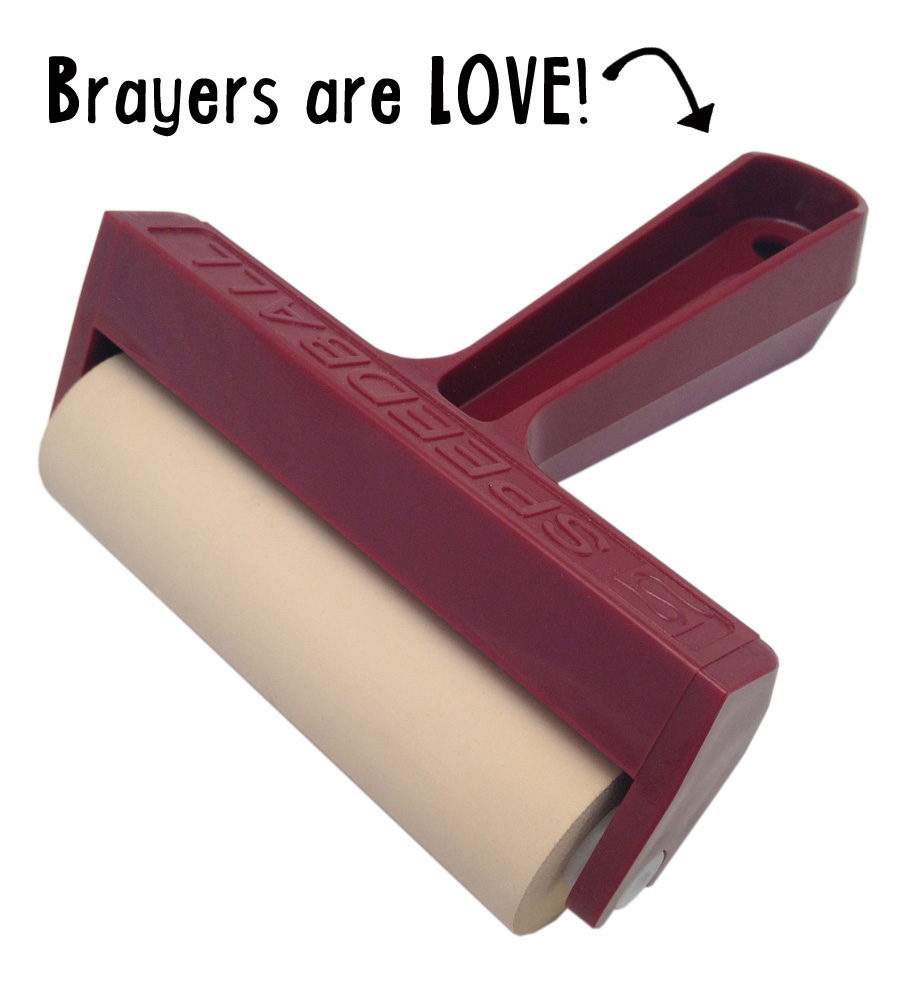
9. Some of you who know me and if you’ve been on my courses you will know that I WORSHIP brayers. I know, strange tool to worship, but truly: they can create super yummy and stunning texture. They create a beautiful grungy pull-me – push-me effect. It’s awesome. I love it. Buy a brayer, you won’t regret it. ;) Brand wise I use speedball, I like the rubber ones, not the soft spongey ones.
10. Golden Fluid Acrylics. Ok look, the Golden brand is stupid, stupid expensive. Silly, stupid expensive. Truly. But. But. But. They DO create the most amazingly beautiful paints. They are beautifully vibrant, the pigments are stunning and so, if once in a while you find yourself with some spare moneys, invest in a pot or two of colours that you love the look of. That said, other acrylics brands work beautifully too. It’s not necessary to use Golden brands to make wonderful art. The Golden products are a luxury kind of option in my humble opinion, but I do love them and use them a lot. (FYI: apparently Cobalt Teal is out of production, if you find one, scoop it up and SELL IT TO ME ;), it’s gorgeous). 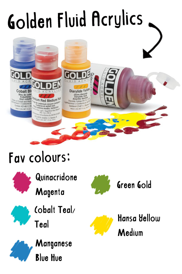
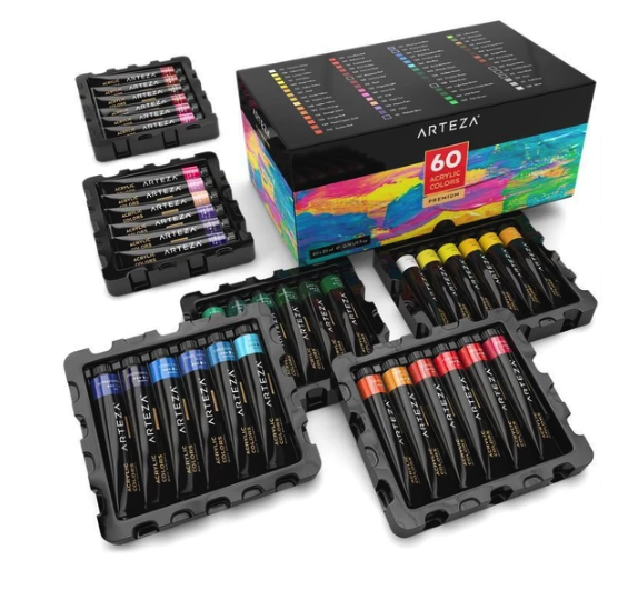
I have also recently been playing with Arteza’s acrylics paints and really love their colour range!
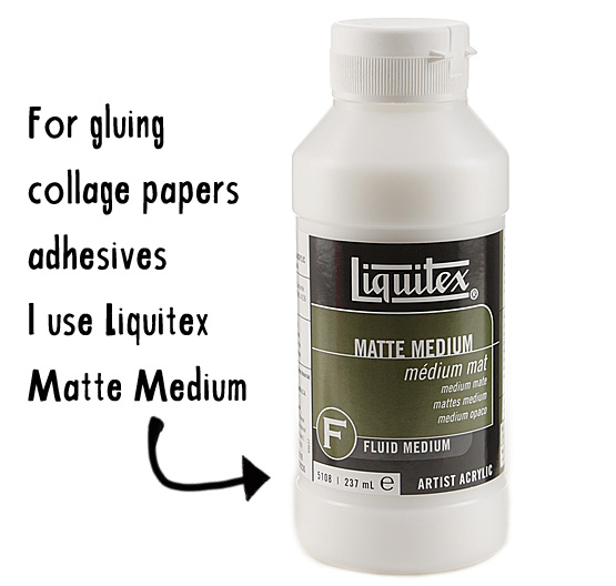
11. A favourite adhesive I use is Liquitex Matte Medium. I use different gel mediums for different things and some are more expensive than others. I have soft gel medium and heavy gel medium by Golden which are much ‘stickier’ than the Liquitex Matte Medium, but they are not necessary to simply glue down collage papers. Additionally Matte Medium can also be used to ‘thin down’ some of your acrylics paints, it’s like an extender of your paints should you want to do that. For thicker collage papers (like some of the scrapbooking papers) I do like using a heavier gel at times as it tends to ‘grab hold’ of it more strongly.
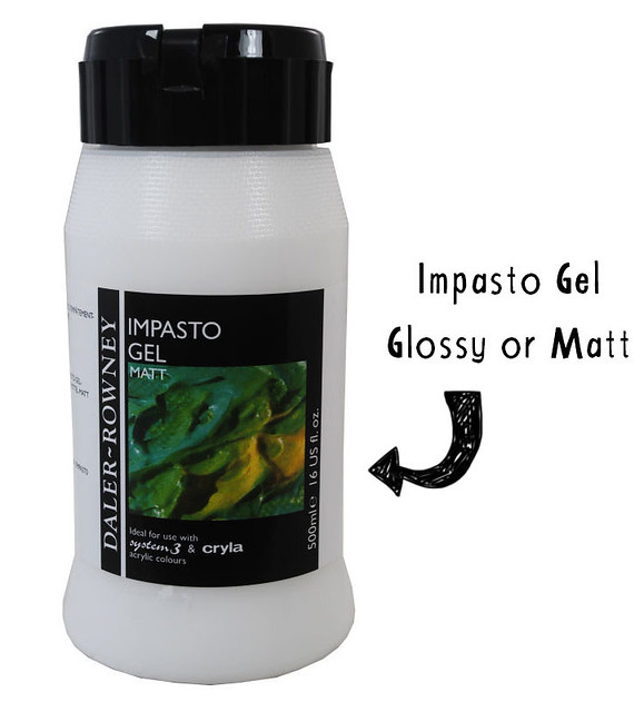
12. Impasto Gel Daler-Rowney – This is also an extender for your paints. The word ‘impasto’ is referring to a paint style. The impasto style is when a painter lays their paint down really thickly in certain areas of a canvas, this medium can extend your paint for this kind of work. However, I use it also mostly for gluing down my collage papers.
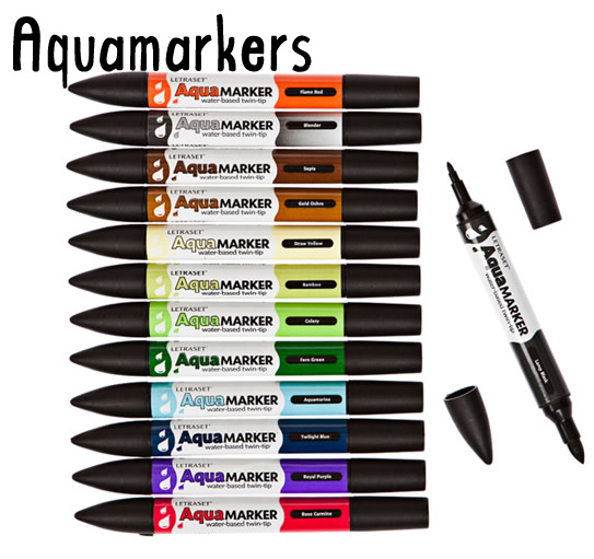
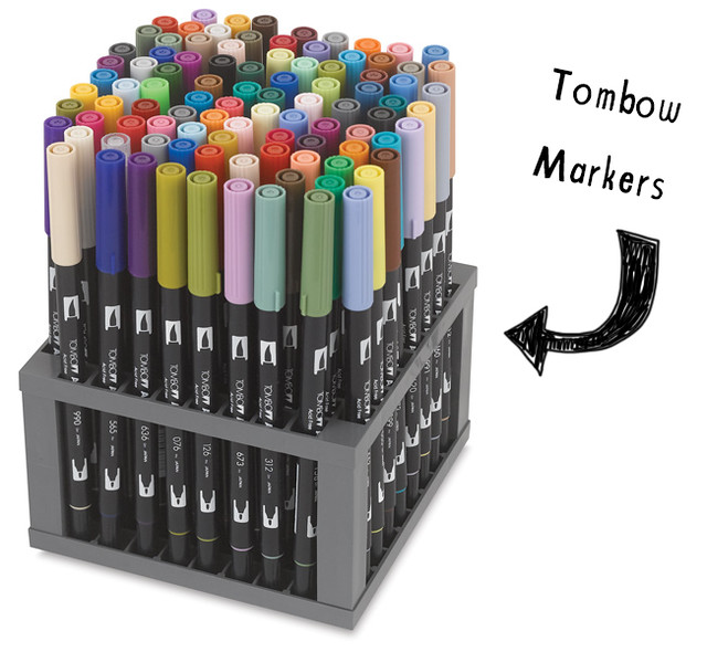
14. Tombow Markers – similar to Aquamarkers, but these have a great brush like tip that I love and the inks are vibrant and juicy. They are pretty pricey though!
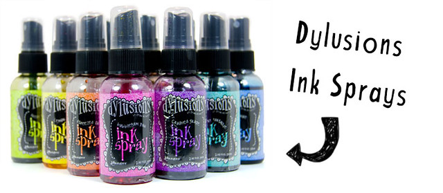
15. Dylusions Spray Inks – I so very much love these inks! The colours are super vibrant and the inks can be used in a variety of ways: spray through stencils, use directly to paint with on a brush, use to splatter & drip! :) All awesome. Remember that these are highly potent inks: they do not dry waterproof and get ‘activated’ pretty much all the time if you work on top of them, so they’re not that good for layering, but if you learn to work with them the ‘right’ way, they can add such beauty to a page! :)
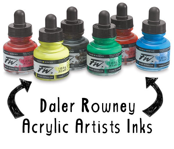
16. Daler-Rowney Acrylics Artists Inks – These inks are not for spraying (though you could transfer them into a spray bottle if you want), they come in a bottle with an ink dropper. The colours too are vibrant and juicy (I’m sensing a theme here, ha!) and these do dry waterproof as they are made of acrylics. I love using them because you can create interesting layers with them, partially they remind me of the high flow fluid acrylics, similar sort of consistency, so you can create a lot of transparency.
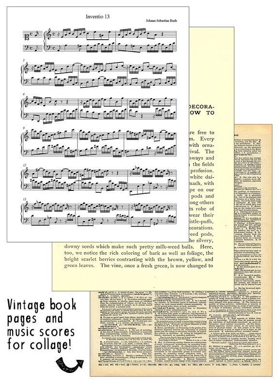
18. Vintage Book Pages & Music Scores – these collage pages almost always make it into my paintings. I love including old book pages and music scores. They add great texture, symbolism and mystery for me! :)
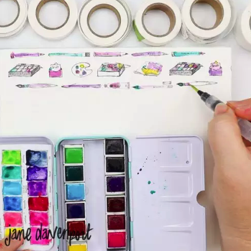
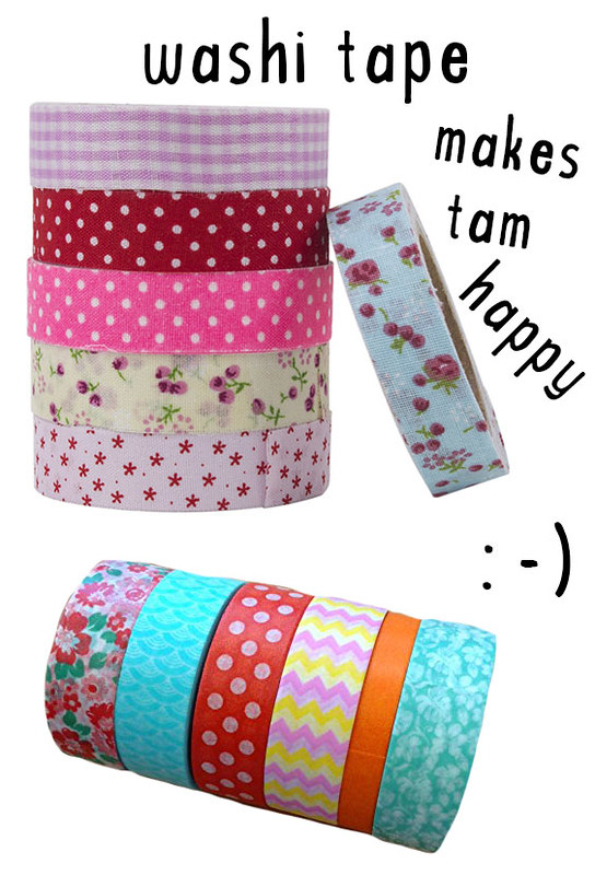
19. Washi Tape – I have a million rolls of washi tape and love using these versatile, brightly coloured pieces of tape! They work great as part of a collage and can add pop, texture and interest to a layered background. Though they are sticky themselves, I tend to put a layer of gel medium under them so that they def stick. I love finding new and different patterns, there are so many different ones out there! :)
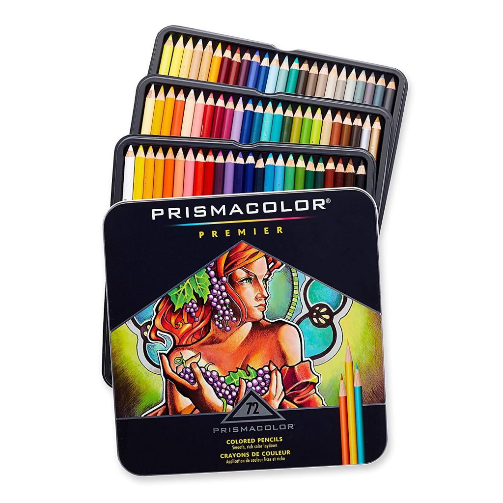
Prismacolor:
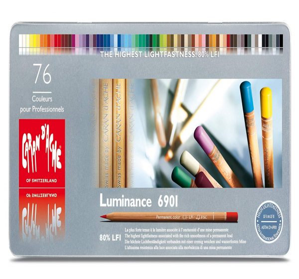
Luminance:
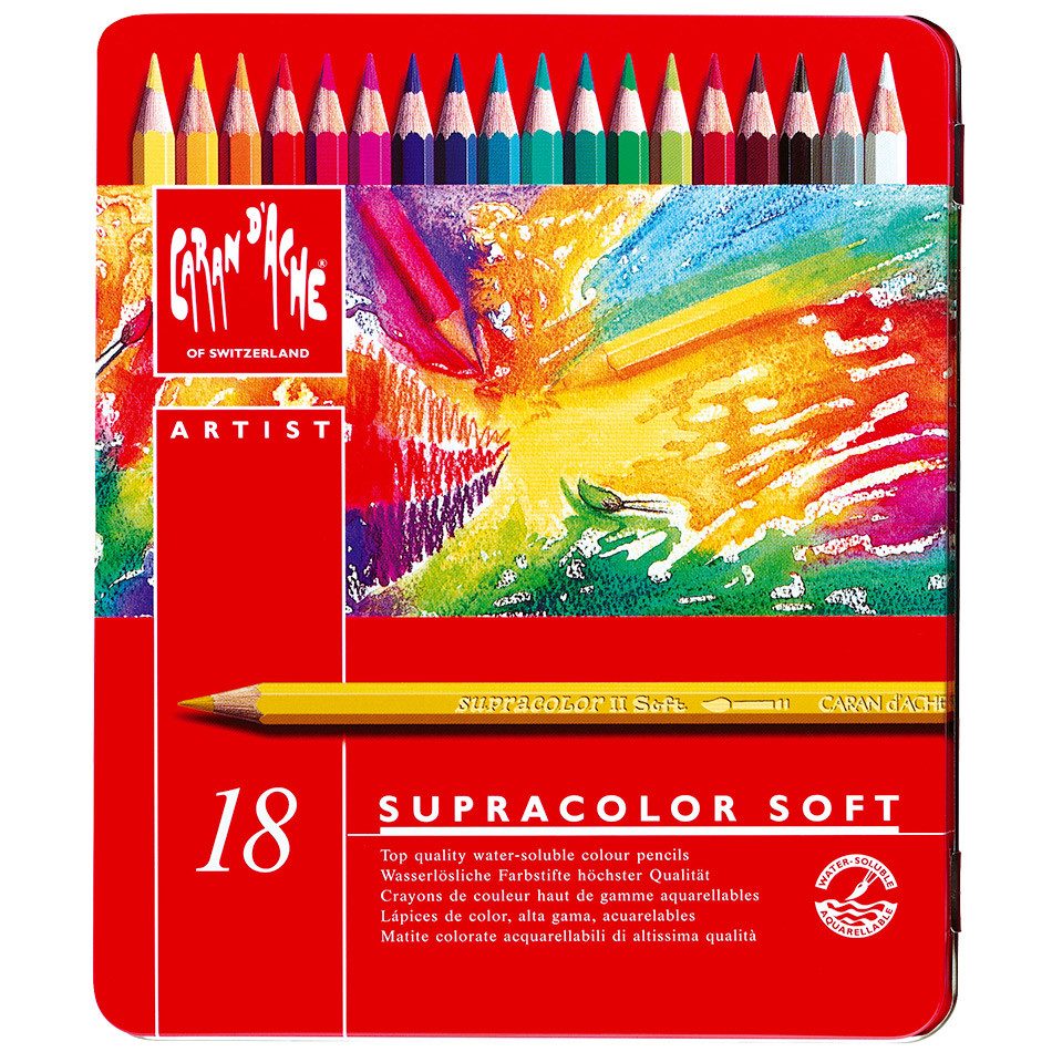
Supracolor:
So, these are some of my current favs! Hope it was useful! Though these are my favourites not all of these products might be or become your favs! I recommend trying out different materials and get to know which ones really work for you.
Let me know what your favourite supplies are in the comment section, I’d love to know! :)
Comments: